When building HTML emails, our two primary goals remain unchanged: maximum flexibility, minimal code complexity.
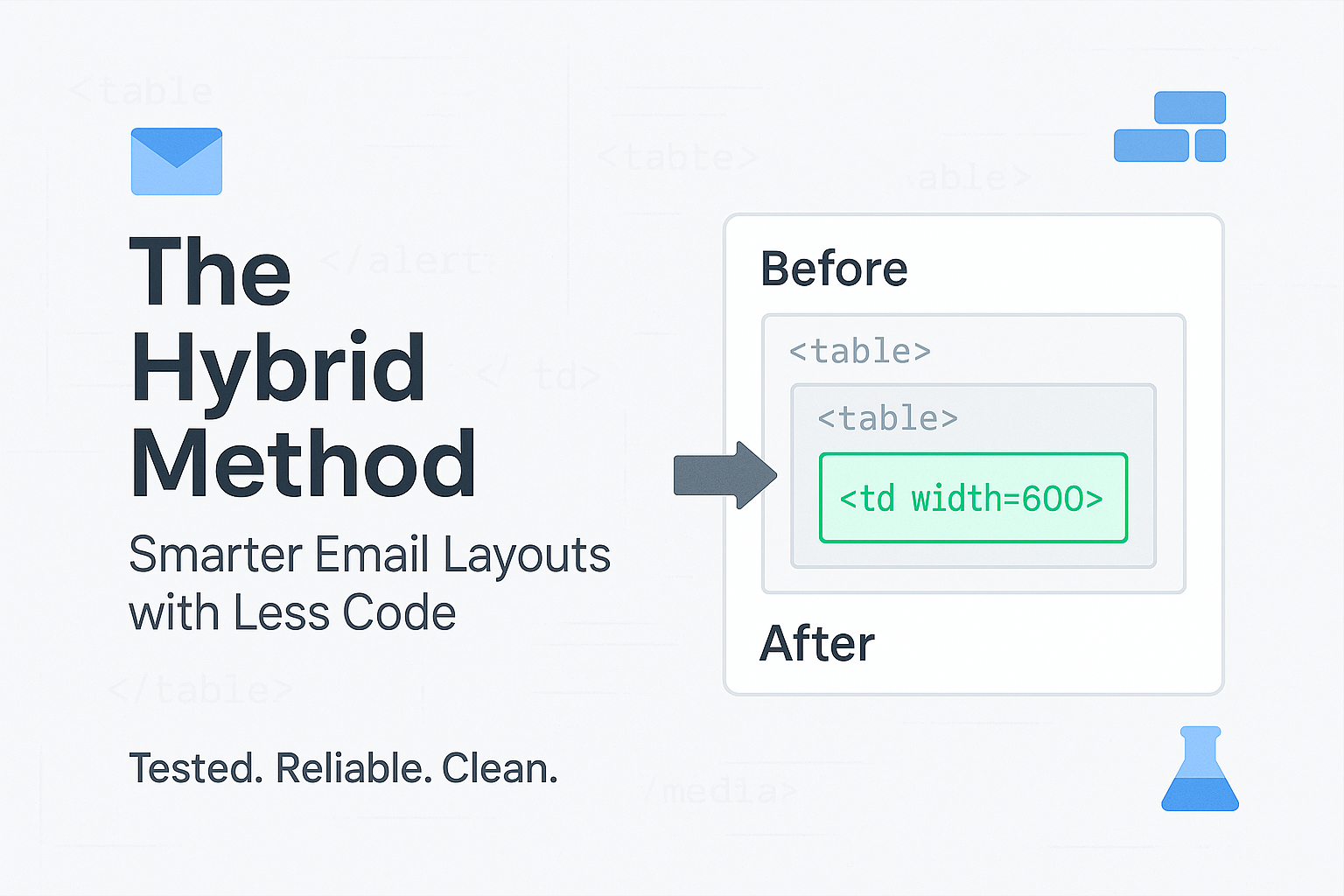
We also want to eliminate those infamous "Outlook Ghost Tables". The unnecessary nested <table>s that developers still sprinkle throughout their codebases to "make Outlook behave". Here's a proven technique that can help.
Most people overlook a very basic shift, but it changes everything.
Instead of applying width on <table> elements, try applying it on the <td> tag. This tiny adjustment leads to a powerful layout mechanic with major side effects:
When you set width on <td> instead of <table>, you're leveraging the natural table cell behavior. Table cells automatically adjust their width based on content and available space, which creates better responsive behavior without media queries.
Traditional approach: <table width="600"> forces rigid width Hybrid approach: <td width="600"> suggests maximum width but allows flexibility


Most builders, even advanced engines like Mailchimp, Stripo, BEE, MJML, overlook this subtle trick.
But once you understand how this shift affects column behavior, fallbacks, and Outlook rendering, you realize that many of the bloated table wrappers and fallbacks are no longer necessary.
Tested across: Gmail, Outlook 2016/2019/365, Apple Mail, Yahoo Mail, Thunderbird
The key to success with this hybrid approach is implementing progressive enhancement. Start with a solid foundation that works everywhere, then layer on the hybrid technique for enhanced behavior in modern clients.
Want to implement this in your workflow? Start with simple one-column layouts and gradually test more complex structures. The key is understanding when this technique shines.